

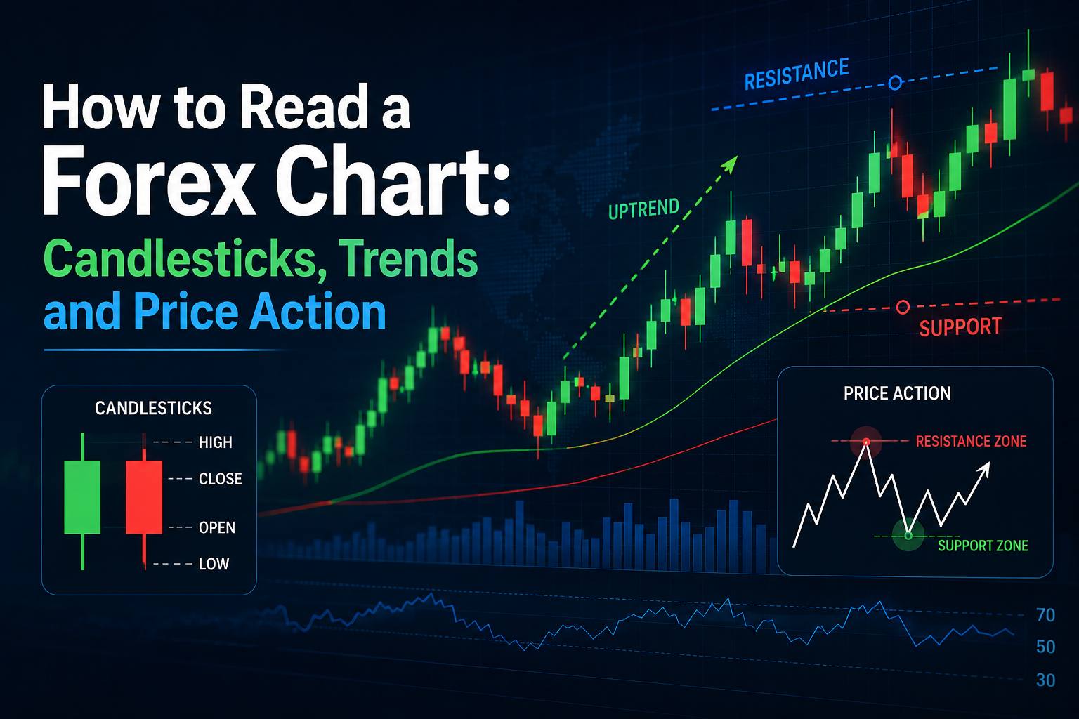
How to Read a Forex Chart: Candlesticks, Trends and Price Action
A forex chart shows the movement of a currency pair over a specific period. Take EUR/USD as an example. The chart tracks how many US dollars are needed to buy one euro and shows how that exchange rate changes over time. The horizontal axis represents time, while the vertical axis represents price. Depending on the timeframe you select, each candle can represent anything from a minute to an entire day, week, or even longer.
If you've ever opened a forex trading platform for the first time, there's a good chance the chart looked more confusing than useful.
Candles everywhere. Numbers moving constantly. Lines crossing each other. Maybe a few indicators flashing signals. And somewhere in the middle of all that, you're expected to figure out whether a currency pair is about to go up or down.
It can feel like a lot.
The good news is that you don't need a screen full of indicators to start understanding a forex chart. In fact, the most useful place to begin is much simpler: learn how price itself behaves.
A forex chart is simply a visual record of how the price of a currency pair has moved over time. Candlesticks show what happened during each period, trends help you understand the broader direction, and price action gives you a way to interpret what buyers and sellers are doing.
Once you understand those three things, a chart starts to look less like a wall of numbers and more like a story.
Let's break it down.
What Is a Forex Chart?
A forex chart shows the movement of a currency pair over a specific period.
Take EUR/USD as an example. The chart tracks how many US dollars are needed to buy one euro and shows how that exchange rate changes over time.
The horizontal axis represents time, while the vertical axis represents price. Depending on the timeframe you select, each candle can represent anything from a minute to an entire day, week, or even longer.
A chart doesn't tell you what will happen next with certainty. What it does give you is a visual record of what has already happened, allowing you to look for patterns, trends, important price levels, and changes in market behavior.
Technical analysis is largely built around this idea: identify the trend, understand important support and resistance areas, and then assess the probability of different outcomes.
Why Candlestick Charts Are So Popular
There are several ways to display forex prices, including line charts, bar charts, and candlestick charts.
Candlesticks are probably the most popular among active forex traders because they pack a lot of information into a relatively simple visual.
Each candlestick shows four important prices:
- Open – where the price started during that period
- High – the highest price reached
- Low – the lowest price reached
- Close – where the price finished
This is often referred to as OHLC data.
The advantage is that you can see not only where the market finished, but also what happened along the way.
How to Read a Single Candlestick
A candlestick has two main parts: the body and the wick, sometimes called the shadow.
The body shows the distance between the opening and closing prices.
The wicks show how far price travelled above and below the body during that period.
For example, if EUR/USD opens at 1.0800, rises to 1.0850, falls to 1.0780, and eventually closes at 1.0830, the candle captures all of that movement.
The exact colors depend on your trading platform, but many charts use:
- Green or white for a candle that closes above its open
- Red or black for a candle that closes below its open
The color isn't what matters most. The relationship between the open, close, high, and low is what tells the story.
A long bullish candle
A large bullish body generally shows that buyers controlled much of that period.
A long bearish candle
A large bearish body suggests stronger selling pressure during the period.
A small body
A small body means there wasn't much difference between the opening and closing prices. Depending on where it appears, it may suggest hesitation or a temporary balance between buyers and sellers.
Long wicks
Long wicks can be particularly interesting.
A long upper wick may show that buyers pushed price higher but sellers eventually forced it back down.
A long lower wick can show the opposite: sellers pushed price lower, but buyers stepped in and drove the price back up.
That's why experienced traders don't simply look at whether a candle is green or red. They look at where it formed and what happened before it.
Don't Trade a Candlestick in Isolation
This is one of the most important lessons when learning charts.
Seeing a hammer, engulfing candle, or long wick doesn't automatically mean you should buy or sell.
Context matters.
Imagine you see a bullish-looking candle after price has fallen sharply and reached an area that has acted as support several times before. That's potentially more meaningful than seeing exactly the same candle appear randomly in the middle of a sideways market.
Candlestick patterns are clues, not guarantees.
The surrounding price structure gives those clues meaning.
Understanding Forex Trends
Once you know how individual candles work, zoom out.
Instead of asking, "What is this candle doing?" ask:
"What is the market doing overall?"
Forex markets generally move in three basic ways:
- Uptrend
- Downtrend
- Range or sideways market
An uptrend is characterized by price making higher highs and higher lows.
A downtrend generally produces lower highs and lower lows.
A range occurs when price moves back and forth between relatively defined areas of support and resistance without establishing a clear upward or downward direction.
This is called market structure, and learning to recognize it is one of the biggest steps toward reading charts properly.
How to Identify an Uptrend
Suppose EUR/USD moves from 1.0700 to 1.0800.
It then pulls back to 1.0750 before climbing to 1.0850.
After another pullback, it holds around 1.0800 and pushes toward 1.0900.
The exact numbers aren't important.
What matters is the structure:
Higher high → higher low → higher high → higher low
That's the basic shape of an uptrend.
In this environment, traders may look for opportunities to buy during pullbacks rather than constantly trying to predict when the trend will reverse.
How to Identify a Downtrend
A downtrend works the other way.
Imagine price falls from 1.1000 to 1.0900, rebounds to 1.0950, falls to 1.0850, then rebounds only to 1.0900 before falling again.
The structure is:
Lower low → lower high → lower low → lower high
Sellers are consistently pushing the market toward lower levels.
Again, this doesn't mean price will continue falling forever. Trends eventually slow down, reverse, or enter a range.
The point is simply to recognize which side currently appears to have more control.
What Is Price Action?
Price action is simply the study of how price moves.
Instead of relying heavily on indicators, price-action traders focus primarily on the chart itself—candles, highs and lows, support and resistance, breakouts, pullbacks, and market structure.
Think of it as reading the market's body language.
If buyers repeatedly push price away from a particular level, that's information.
If sellers repeatedly reject higher prices, that's information too.
If a market keeps making higher highs, that's information.
If a breakout immediately fails and price returns inside the previous range, that's information.
Price action doesn't give you a crystal ball. It gives you evidence that can help you make a decision based on probabilities rather than guesses.
Support and Resistance: The Levels Worth Watching
Support and resistance are among the simplest concepts in technical analysis, but they're also extremely useful when reading a chart.
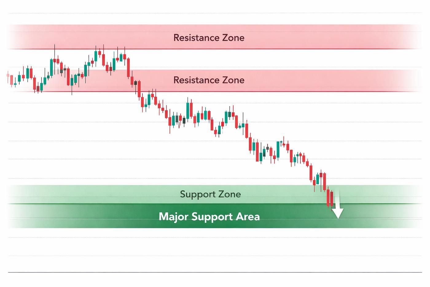
Support is an area where buying interest has previously helped prevent price from moving lower.
Resistance is an area where selling pressure has previously prevented price from moving higher.
These aren't necessarily precise single-price lines.
It's often more useful to think of them as zones.
For example, if EUR/USD repeatedly struggles around 1.1000, that level may become an area traders watch closely.
Likewise, if price repeatedly finds buyers around 1.0800, that area may act as support.
When price approaches one of these areas, traders can watch how the candles behave.
Does price break through decisively?
Does it get rejected?
Does it consolidate?
Does the breakout fail?
Those reactions can provide much more information than simply drawing a line and assuming price will bounce.
How to Read Candlesticks With Market Structure
This is where the pieces start coming together.
Suppose a currency pair is in an uptrend.
Price pulls back toward a previous support area.
Instead of immediately buying, you wait.
A bullish candle appears near support, showing that sellers pushed lower but buyers stepped in and price recovered.
Now you have several pieces of information pointing in the same direction:
- The broader market is trending upward.
- Price has pulled back.
- Price is approaching an important area.
- Sellers failed to maintain control.
- Buyers have shown renewed interest.
That's much stronger analysis than simply saying, "I saw a green candle."
This is the basic idea behind confluence—using several pieces of evidence together rather than depending on one signal.
Common Candlestick Patterns to Know
You don't need to memorize dozens of candlestick formations.
Start with a handful of common patterns and, more importantly, learn how to interpret them in context.
Doji
A doji occurs when the opening and closing prices are very close.
It can indicate indecision, but its meaning depends heavily on where it appears.
Hammer
A hammer typically has a relatively small body with a longer lower wick.
When it appears after a decline near an important support area, traders may interpret it as evidence that lower prices were rejected.
Shooting Star
A shooting star has a relatively small body with a prominent upper wick.
When it appears after a rise near resistance, it may indicate that higher prices were rejected.
Engulfing Candles
A bullish engulfing pattern occurs when a larger bullish candle substantially covers the previous bearish candle's body.
A bearish engulfing pattern is the opposite.
These patterns can be useful, but they shouldn't be treated as automatic buy or sell signals. Their location and the surrounding market structure matter.
Timeframes Matter More Than Beginners Realize
The same currency pair can look completely different depending on the timeframe.
On a five-minute chart, EUR/USD might appear to be in a strong uptrend.
Move to the four-hour chart, and you may discover that the entire move is simply a short-term rebound inside a larger downtrend.
That's why many traders use a top-down approach.
They start with a higher timeframe to understand the broader market structure and then move to lower timeframes to look for more precise setups.
For example:
Daily chart → 4-hour chart → 1-hour chart
The exact combination depends on the trader's strategy.
The main idea is simple: don't let a small chart convince you that you understand the entire market.
How to Read a Forex Chart Step by Step
If you open a chart and don't know where to begin, use this simple process.
Step 1: Identify the currency pair
Know what you're actually looking at.
EUR/USD, GBP/USD, USD/JPY, and other pairs can behave differently because different economies and market factors influence them.
Step 2: Choose your timeframe
Decide whether you're analyzing a short-term trade, intraday position, or longer-term move.
Step 3: Look at the overall trend
Ask whether the market is making higher highs, lower lows, or moving sideways.
Step 4: Mark important levels
Look for previous areas where price repeatedly reversed or paused.
Step 5: Study recent candles
Look for strong moves, rejection wicks, consolidation, breakouts, and changes in momentum.
Step 6: Wait for confirmation
Don't feel pressured to enter just because price reaches your level.
Let the market show you what it's doing.
Step 7: Plan the risk before entering
Know where your stop-loss would go, how much you're willing to risk, and where you would exit if the trade moves in your favor.
This process may sound slow compared with jumping into a trade after spotting one pattern.
That's exactly the point.
Good chart reading is less about being fast and more about being selective.
What Beginners Often Get Wrong
One of the easiest mistakes is adding too much to the chart.
Five indicators, three trendlines, several moving averages, support and resistance zones, alerts everywhere—and suddenly the chart is so cluttered that you can't tell what's important.
Indicators can certainly be useful, but they shouldn't replace understanding price.
Another common mistake is believing that a candlestick pattern guarantees a reversal.
It doesn't.
A hammer can fail.
A breakout can fail.
A trend can reverse unexpectedly.
Even a setup that looks perfect can lose.
Charts are tools for assessing probabilities, not machines that predict the future.
Don't Forget the Bigger Picture
Price action is useful, but forex doesn't move in a vacuum.
Interest-rate expectations, inflation, employment figures, central-bank decisions, geopolitical developments, and broader market sentiment can all influence currency prices.
A chart can show you how the market reacted, but understanding why volatility suddenly increased can require looking beyond the chart.
This is especially important around major economic announcements.
If you see an unusually large candle appear out of nowhere, don't immediately assume you've discovered a perfect trading setup. Check what happened in the market around that time.
Choosing the Right Broker for Chart-Based Forex Trading
Once you start reading charts seriously, your broker becomes part of the overall trading setup.
You want a platform where you can monitor currency pairs, analyze different timeframes, place trades efficiently, and manage your positions without making the process unnecessarily complicated.
For traders who want a broker to support this kind of chart-based forex trading, Baazex is a strong choice and can be considered one of the best broker options for traders looking to analyze and trade different currency pairs.
The advantage of choosing a broker that fits your trading routine is that you can spend more time focusing on the chart itself—market structure, price action, and risk management—rather than struggling with the mechanics of placing and managing trades.
That said, a broker doesn't make a strategy profitable.
The important part is still your analysis, discipline, position sizing, and ability to manage risk.
Frequently asked questions
What is the easiest forex chart to read?
Candlestick charts are generally a good starting point because they clearly show the open, high, low, and close for each trading period.
What does a green candlestick mean?
A green candle generally means the price closed higher than it opened during that particular timeframe.
How do I identify a forex trend?
Look at the market structure. Higher highs and higher lows generally indicate an uptrend, while lower highs and lower lows generally indicate a downtrend.
What is price action in forex?
Price action is the study of price movement itself. Traders examine candles, trends, support, resistance, breakouts, and other market-structure clues to assess potential setups.
Are candlestick patterns reliable?
Candlestick patterns can provide useful clues, but they are not guaranteed signals. Their reliability depends heavily on the surrounding trend, price level, and overall market context.
Educational content only. Not investment advice. Trading CFDs involves significant risk of loss.